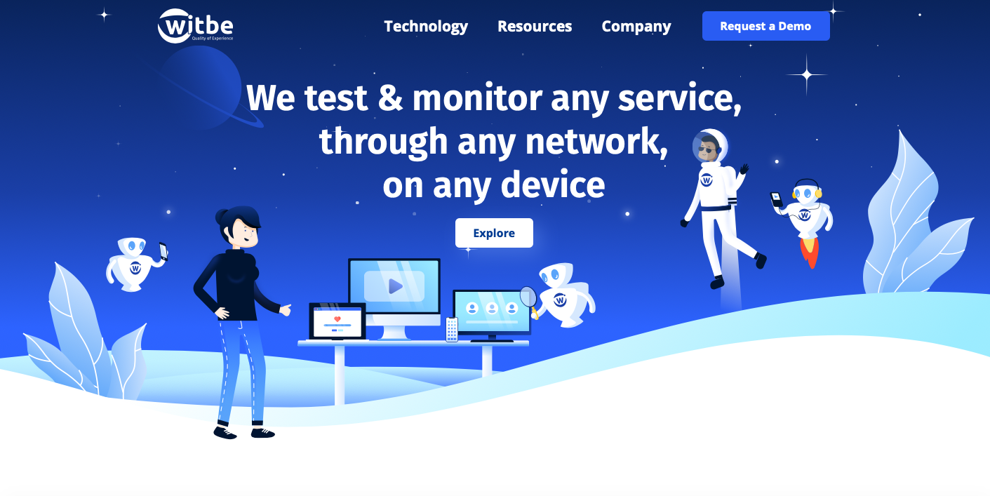
Witbe, a leader in quality of experience (QoE) monitoring, has enhanced its visual identity with a new logo and website. Under the new marketing team’s directive, this redesign is a transformation of Witbe’s image to fit the current dynamic better. Without forgetting the past, the new logo 'unites seriousness and simplicity, while still becoming more modern'. More refined and efficient, the company states that 'this rebrand solidifies the company’s stance as an industry leader in QoE monitoring and represents the dynamism and wit of Witbe’s teams'.
Aligning around this new direction, this redesign can first be seen on the company’s website. More functional and instructional, the new website - www.witbe.net - offers a clear and precise overview of the different ways Witbe continues to develop how we measure and control the quality of a service. This website innovates on the way the company presents products while aggregating many articles and resources to better understand the necessity of Witbe’s technology in a user-centric world. It’s an evolution and this new identity will also be at the core of all the products Witbe will be announcing in the coming weeks.
"It was essential for Witbe to develop this new graphical identity to represent the values of the company better while preserving our co-founder’s essence," said Mathieu Planche, chief executive officer of Witbe. "Developed internally by our new marketing team, this new logo and website is the new step of our Operation Orion. The work continues, and many new items will be announced before the end of the year, including new product innovations."